
Write characteristics of styles.
How they link to an artistic movement.
Show examples of games.
Photorealism
Photorealism is a style of art that reflects an image of objects from any given environment. The artist who is trying to create something in the style of photrealism will try to make their work look as realistic as possible. In a sense the best way to test if you have acheived this is when the viewer has no idea wether or not they are looking at a photographic image or a painting.
 I find that when the artist pays paticular attention to reflections and colour in their pieces they paint their image so there is no distint difference to real life.
Art deco incorperates grand and linier curves into forms and images from
real life. Photorealism and art deco arn't necessary the same thing but I
find that art deco takes characteristics from photorealism, such as
forms like the human body, and adds simplistic (or complicated) designs
to the form. So whilst it's changing the forms exterior motives it's
staying true to the shape that it has evolved from.
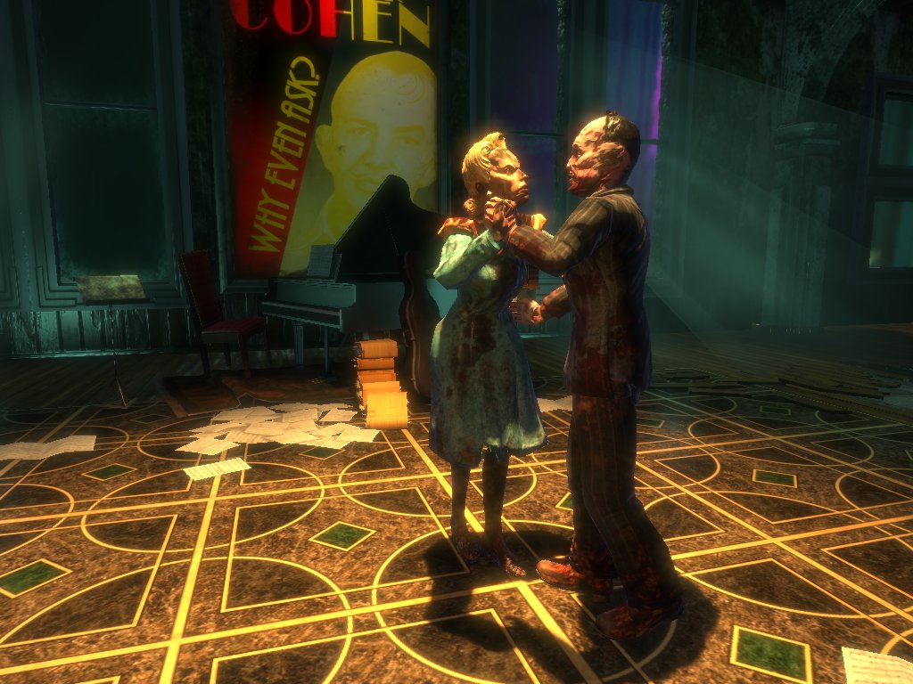
Bioshock seems as though it would be the most obvious game to link photorealism and art deco, and it is. The environment is covered with posters, wallpaper and clothing that all spawn from the syle of art deco. And the deveopers present this art movement to the player in the most realistic way possible. The attention to detail is perfect and is always a strong factor when the player traverses the city of Rapture. The colours of the environment always stay true to the movement. Such as the tiles in the image to the right. Look at how a large portion of a square tile is covered with dull brown and the centre is coloured with a lush emerald. And to top it off, the tiles edges are lined off with a grand gold colour. The game portrays a sort of majesty, and at the same time creates a dark and gritty feeling.
Black and White
The style of black and white art is often quite a mesterious and simplistic design. It's usually used to create fear and sorrow whilst the viewer inspects the image. Creating these feelings can be quite a challenge however. To strike fear into the viewer it is often best to apply the style of black and white to images that create questions of the unknown. Take the feeling that a person will undergo when they're in the dark and they hear something outside or downstairs. Logically it could be something simple and harmless but during the night whilst the person is in the dark it stirs questions and creates fear of the unknown. I believe this is the correct use of the style.
I feel as though the art movement of surrealism can be linked to the psychological mind games that the style of black and white imagry brings to the table. Most of the time surrealism is based off of the random dreams that artists have experienced. This can easily be applied to the style of black and white, what better way to experience someones subconcious then to be fearing every step of the way through the environment. Both the style and the artistic movement have something to do with the subconcious of the players mind. The art form being a manifestation of the developers unconcious messages, and the style swaying the emotions of the players fears.

Limbo utalises both the style and art movement exceptionally. Although the stlye of black and white is more dominant, and sometimes overpowers the surreal aspect of the game, they both go hand in hand when they are equally used. The game's environment is set in a forest and emits an erie unknown atmosphere. The creatures in this environment are large and boney. What I find interesting about the creatures in this game is that the player will feel scared of their power and form, yet they cannot see their detail. All the player has is a silloette to go from. This is again the fear of the unknown generating the player's caution.
Pixel
Pixel designs are combinations of pixels that are visible to the naked eye, this can be used to draw objects, shade them or be used to create drawings with shaded effects. The pixel style is simplistic but can be used effectivly to create vibrant designs that aren't to complicated to analyse. Shading is a very flexible technique that can be used in pixel art. It's tonal changes can be as gradual or as bold as the artist desires.

Pixel art can be linked to a style of art known as 'popular art'. I main reason I'm making this connection is because of the way the image to the left has been filled. The skin of the subject has been coloured with small circles the the view can see. although it isn't exactly the same concept and design as pixel art, you can clearly see where each segment of colour is placed. Tonal work is very bold and explicit. Instead of gradual tonal work, the artist has either just used one basic colour with a black outline. But when the artist has tried to create shadows he has used black, again the artist chose to not use gradual tonal work.

Megaman X is a perfect example of pixel art being used effectively. In the image to the right, the environment is designed to look futuristic and developed, ofcourse this isn't something that can be designed in a simlistic mannor, machinery demands detail to look mechanical.But on close inspection the player can see the pixels that make up the environment and the sprites. Unlike the artwork above, Megaman X has more flow when it comes to colour. The player can still see large contrasts in colour, but there are more tonal shades compared to the pop art above.
No comments:
Post a Comment